
Before diving into the various components that Experlogix Documents offers, it's crucial to grasp the settings that govern these components.
Understanding Web Form Component Settings
While each component may have unique settings, many settings are common across most components. Here’s a breakdown of these settings by type:
|
Setting Type |
Description |
|---|---|
|
Display |
Settings that alter the visual appearance of field elements. |
|
Data |
Settings that determine how field data is managed. |
|
Validation |
Settings for configuring front-end validations on the field. |
|
API |
Settings to configure the API endpoint for the field, including custom properties. |
|
Conditional & Logic |
Settings to establish basic conditional workflows or advanced logic. |
|
Layout |
Settings to configure HTML properties. |
Users can preview the settings they are modifying via the Preview section. This feature is beneficial as it allows users to see the changes in real-time before applying them.
Display Settings
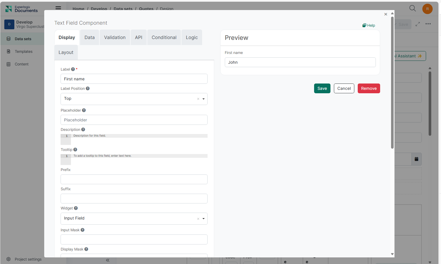
These settings modify the front-end user interface of a component. When you edit the component settings, the Display settings tab opens by default.
|
Setting |
Description |
||||||||||||||
|---|---|---|---|---|---|---|---|---|---|---|---|---|---|---|---|
|
Label |
The front-end name for the component. By default, the label displays at the top left of the field. |
||||||||||||||
|
Label Position |
The label location of the component can be customized. The default position is set to Top, but several other options are available:
|
||||||||||||||
|
Label Width & Margin |
When the Left or Right Label Position alignment options are selected, the label width and margin settings become available. These options allow for padding to be added to the respective position of the component, creating space between the label and the component. The width and margin values are based on the field's span percentage on the Web Form. Use the label position when formatting your Web Form in a grid-like fashion or to save vertical space on your Web Form. |
||||||||||||||
|
Placeholder |
A short descriptive text that describes the expected value that the user should enter in the field. The Placeholder displays when the field is empty and is not submitted to the server when the Web Form is submitted. Use Placeholder as helper text for users filling out the field. |
||||||||||||||
|
Description |
Adds a Description that displays below the field. This setting can be used as an alternative to the Placeholder or in addition if further details are needed for the field. Use HTML in the setting field to style the content of the Description. |
||||||||||||||
|
Tooltip |
Adding content to the Tooltip setting adds a new UI element to the field represented by a question icon next to the field label. The content inside the Tooltip setting displays when a user hovers over the UI element. Use HTML in the Tooltip setting field to style the content inside the Tooltip. Tooltips are a great way of providing detailed instructions or helper tips without taking up space on your Web Form. |
||||||||||||||
|
Prefix |
Adds text or characters before the input field. This can be used to categorize or label a field, like using $ for currency. |
||||||||||||||
|
Suffix |
Adds text or characters after the input field. This can be used to categorize or label a field, like using % to represent a percentage. |
||||||||||||||
|
Custom CSS Class |
Applies unique styling and formatting to your fields by adding Custom CSS Classes. Experlogix Documents utilizes Bootstrap as the default CSS framework for the renderer. Below are examples showcasing a few different Custom CSS Classes you may find useful and the class code:
|
||||||||||||||
|
Tab Index |
Sets the Tab Index attribute of this component to override the Web Form's tab order. Setting the tab order for all components on the Web Form gives you control over the entire tab order of the Web Form. See the MDN documentation for more tab index information. |
||||||||||||||
|
Auto Complete |
Enabled by default, input fields automatically populate data from values previously entered by the user dictated by the cache of the user's browser. Input the |
||||||||||||||
|
Hidden |
Hidden components do not display on the Web Form but are still part of the Web Form JSON and submission. This setting can be helpful when calculating data that should not be visible to the front-end user. Current Date/Time
|
||||||||||||||
|
Hide Label |
Hides the label of a field. You can save vertical space on a Web Form by hiding the field label and utilizing other display settings such as a Placeholder or Tooltip to identify the field. |
||||||||||||||
|
Hide Input |
Masks the input of the field by replacing characters with circle characters often seen on password fields. Use this setting when handling sensitive data such as a Tax ID or Social Security Number. The Hide Input setting masks the field visually but does not encrypt the data on the server. Never use this setting for collecting passwords or authentication credentials. |
||||||||||||||
|
Initial Focus |
When the Web Form loads, the component with Initial Focus enabled becomes the active field. The cursor is placed in the field so the user can start typing immediately. Ensure that only one component has this setting enabled. If multiple components have it, only the last one in the JSON structure will be focused. |
||||||||||||||
|
Allow Spellcheck |
Enable or disable spellchecking functionality for the input field where tags or text are entered. |
||||||||||||||
|
Disabled |
Prevents users from focusing and inputting data into the field. Use Disabled fields with Calculated Values to prevent users from altering calculations or populated values. Disabled fields always display in gray. |
||||||||||||||
|
Modal Edit |
Replaces the field with a button that, when clicked, launches a dialog to input and edit field data. Enable this setting for a layout component to contain multiple fields inside a single dialog. |
Data Settings
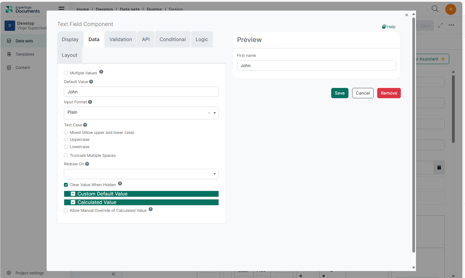
Data settings are primarily used to configure end-user input data, determine how it interacts with other field data within the Web Form. Use Data Settings to perWeb Form tasks such as setting a default value or configuring data calculations.
|
Setting |
Description |
||||||||||||||||||||||||||||||||||||
|---|---|---|---|---|---|---|---|---|---|---|---|---|---|---|---|---|---|---|---|---|---|---|---|---|---|---|---|---|---|---|---|---|---|---|---|---|---|
|
Multiple Value |
Introduces an Add Another button below the field, allowing users to add or remove multiple rows of a component. Data is saved as an array within the submission. |
||||||||||||||||||||||||||||||||||||
|
Default Value |
Sets the default input value for the field, which displays when the Web Form is rendered. If left unchanged, the default value data is saved with the submission. |
||||||||||||||||||||||||||||||||||||
|
Truncate Multiple Spaces |
Removes any unnecessary spaces between words or characters within the field. |
||||||||||||||||||||||||||||||||||||
|
Redraw On |
Refreshes the component when a specific change occurs. The Redraw On setting dropdown offers options to redraw the component when any change occurs on the Web Form or when a specific field changes. Use this setting for interpolating data for calculations or logic when dynamic changes occur on the Web Form, or for setting up Dynamic Select Filtering workflows. |
||||||||||||||||||||||||||||||||||||
|
Omit Value From Submission Data When Conditionally Hidden |
Determines the behavior of a field's value when the field becomes conditionally hidden on the Web Form:
However, fields hidden through the Hidden setting in the component's Display tab will retain their data in the submission, even if this property is enabled. Example Scenarios:
|
||||||||||||||||||||||||||||||||||||
|
Custom Default Value |
Expand the Custom Default Value tab and write custom JavaScript or JSON Logic to set the field's default value. |
||||||||||||||||||||||||||||||||||||
|
Calculated Value |
Expand the Custom Default Value tab and write custom JavaScript or JSON logic to set up calculation logic on the field. This section allows you to write custom JavaScript snippets that will be evaluated to perWeb Form advanced calculations within your component. Example Caluation of data a and b:
Evaluation Context Variables:
|
||||||||||||||||||||||||||||||||||||
|
Allow Manual Override of Calculated Value |
Allows input data to override calculations set on the field. By default, the field value cannot be entered when a calculation is set. Check this setting to allow users to override the field calculation and set their own value. |
||||||||||||||||||||||||||||||||||||
|
Server Override |
Overrides current component settings when the Web Form submission is processed on the server side. Useful for removing hidden data after Web Form submission when Omit Value From Submission Data When Conditionally Hidden is disabled. |
Validation Settings
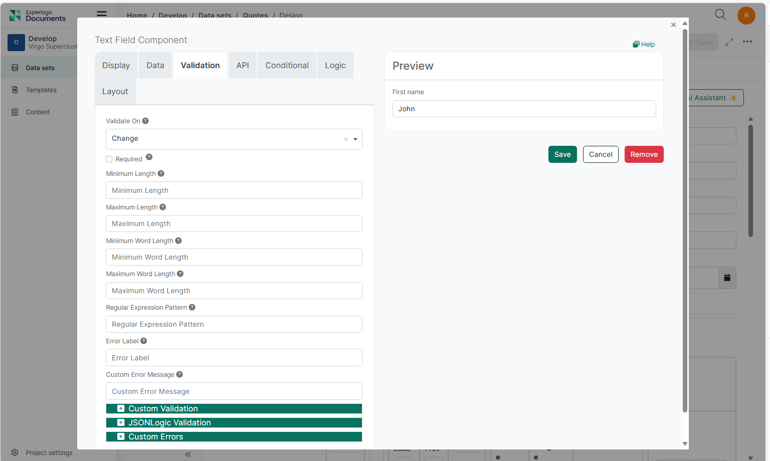
Settings found in the Validation Tab relate directly to the configurable Front-End validations for the field. Validation covers settings such as required fields, unique data, min/max requirements, custom validations, and custom error messages.
|
Setting |
Description |
||||||||
|---|---|---|---|---|---|---|---|---|---|
|
Validate On |
Determines when the field's front-end validation occurs based on the option selected.
|
||||||||
|
Required |
The Required setting is represented by a red asterisk next to the field label and forces the user to enter a value before the Web Form is submitted or the user progresses to the next page of a Web Form. |
||||||||
|
Unique |
Upon submission, a query is done on the back end to ensure the data entered into the field is unique. Apply this setting to an Email field on a registration Web Form to ensure the address being entered has not been submitted to the database. |
||||||||
|
Validate When Hidden |
When this setting is enabled, the component is validated when it is hidden or conditionally hidden. The validation errors of the hidden components are shown in the Web Form errors alert when submitting the Web Form. A hidden component holding an invalid value while Validate When Hidden is enabled will prevent the Web Form user from submitting the Web Form, without giving them direct access to the component to correct the invalid value. Ensure your Web Form workflow accounts for this behavior. |
||||||||
|
Minimum / Maximum Length |
The Minimum or Maximum length requirement the field value must meet. This behavior changes depending on what component the setting is being applied to:
|
||||||||
|
Regular Expression Pattern |
Often referred to as Regex, this setting allows you to apply a pattern (or filter) that details a set of strings that must match the pattern. With a Regex Pattern set, the string must match the pattern before the Web Form can be submitted. |
||||||||
|
Error Label |
Change the field name displayed within the validation message when validation is triggered. Use the Error Label when a field has a long label or name to shorten validation messages. |
||||||||
|
Custom Error Message |
Write a Custom Error Message that overrides the default front-end validation message displayed on the Web Form when validation is triggered. |
||||||||
|
Custom Validation |
Expand the Custom Validation tab and write JavaScript or JSON logic to set up your own validation rules for the field. |
||||||||
|
Secret Validation |
This setting hides the JavaScript validation rules defined within Custom Validation from the JSON Web Form definition and component settings for any user that does not carry the Portal Base Project Administrative role. While the validation functions normally for all users, non-administrative users will see the following JSON in the Web Form definition: customPrivate: true. Additionally, the Custom Validation JavaScript code block will be blank for these users when viewing the field settings. |
||||||||
|
Custom Errors |
Set different custom error messages for multiple errors. Example:
|
API Settings
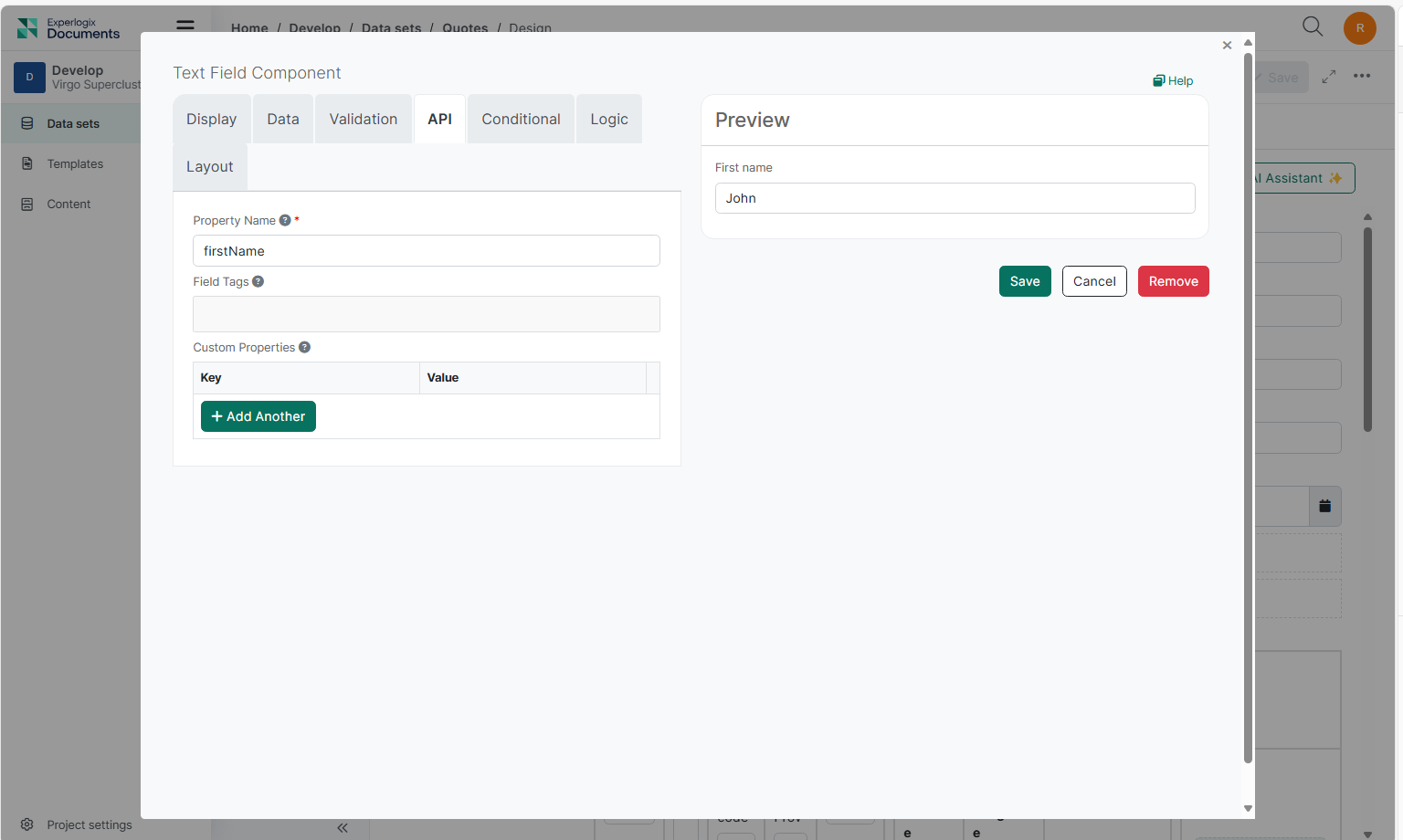
Component settings found in the API tab contain back-end settings such as the field's Property Name as well as custom properties that can be set such as HTML and Tags.
|
Setting |
Description |
|---|---|
|
Property Name |
The back-end field identifier for the API endpoint. This field is auto-populated in CamelCase based on the initial Label given to the field. Each field's Property Name must be unique on the Web Form before the Web Form can be saved. Use the Property Name when referencing the field via API or conditional logic. |
|
Field Tag |
The Field Tag inherently does not provide any kind of functionality to the field, however, the tag can be used or referenced inside the application layer to facilitate different workflows or used to trigger workflow logic within the Web Form. |
|
Custom Properties |
Apply Custom Properties to the field via key and value pairs. |
Conditions and Logic Settings
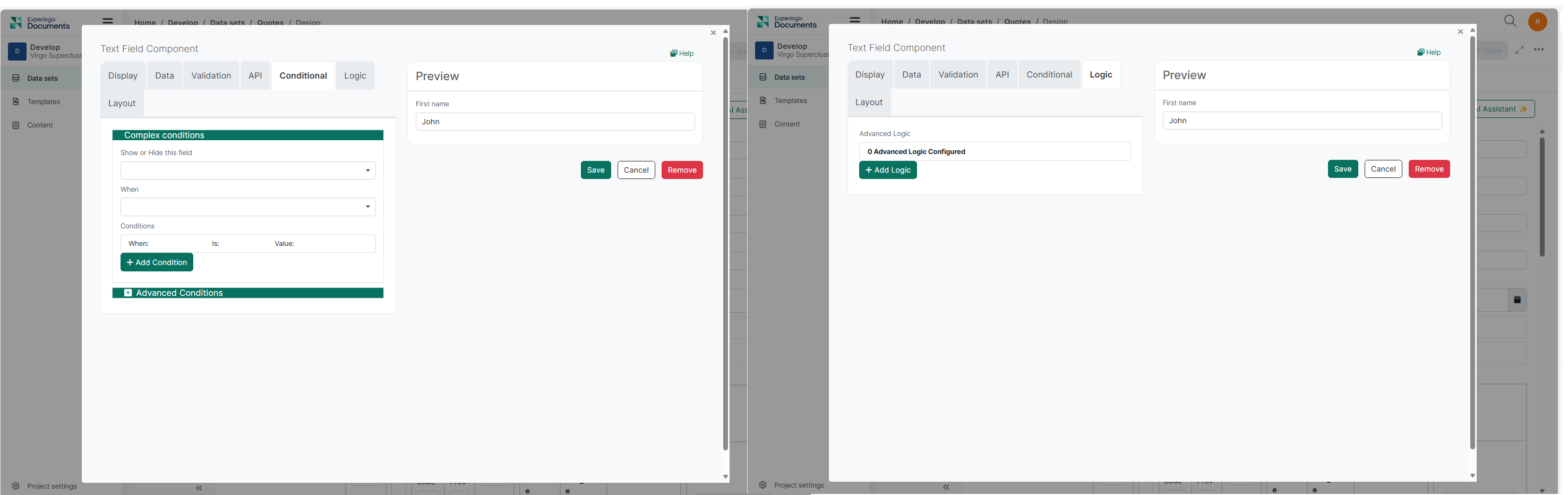
The Conditions and Logic tab provides robust settings to create intelligent workflows. Utilize this to show or hide fields, merge component JSON schema, conditionally set field settings, and more, all based on user interactions with the Web Form. This ensures Web Forms are dynamic and responsive, with behavior tailored to user inputs.
|
Setting |
Description |
|---|---|
|
Show/Hide Fields |
Dynamically sets fields to show or hide based on user input or other conditions. This allows for a more interactive and user-friendly Web Form experience. |
|
Merge Component JSON Schema |
Merge the JSON schema of components conditionally to create dynamic and flexible Web Form structures. This is useful for complex Web Forms that require different configurations based on user input. |
|
Conditionally Set Field Settings |
Set field settings conditionally based on user interactions. This can include setting default values, making fields required, or applying custom validation rules dynamically. |
|
Custom Logic |
Write custom JavaScript or JSON logic to implement advanced conditional behaviors and workflows. This allows for highly customized and specific Web Form behaviors tailored to your organization's needs. |
Layout Settings
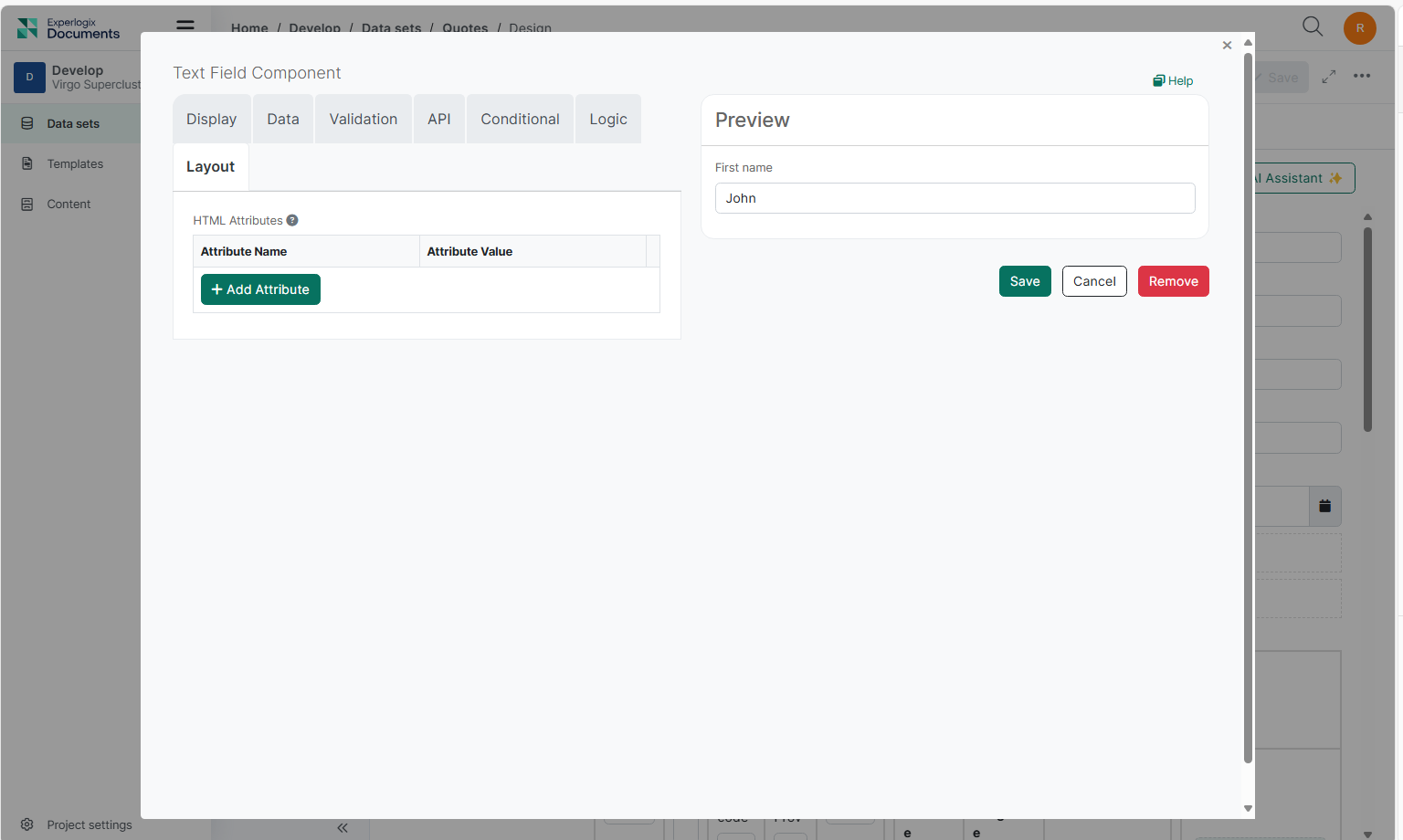
The Layout tab allows you to apply HTML attributes. This provides flexibility in customizing the appearance and arrangement of Web Form elements, ensuring a well-structured and visually appealing layout.
|
Setting |
Description |
|---|---|
|
HTML Attributes |
Provides a map of HTML attributes for the component's input element. Attributes from other component settings or other attributes generated by Web Form take precedence over the configured HTML Attributes. |